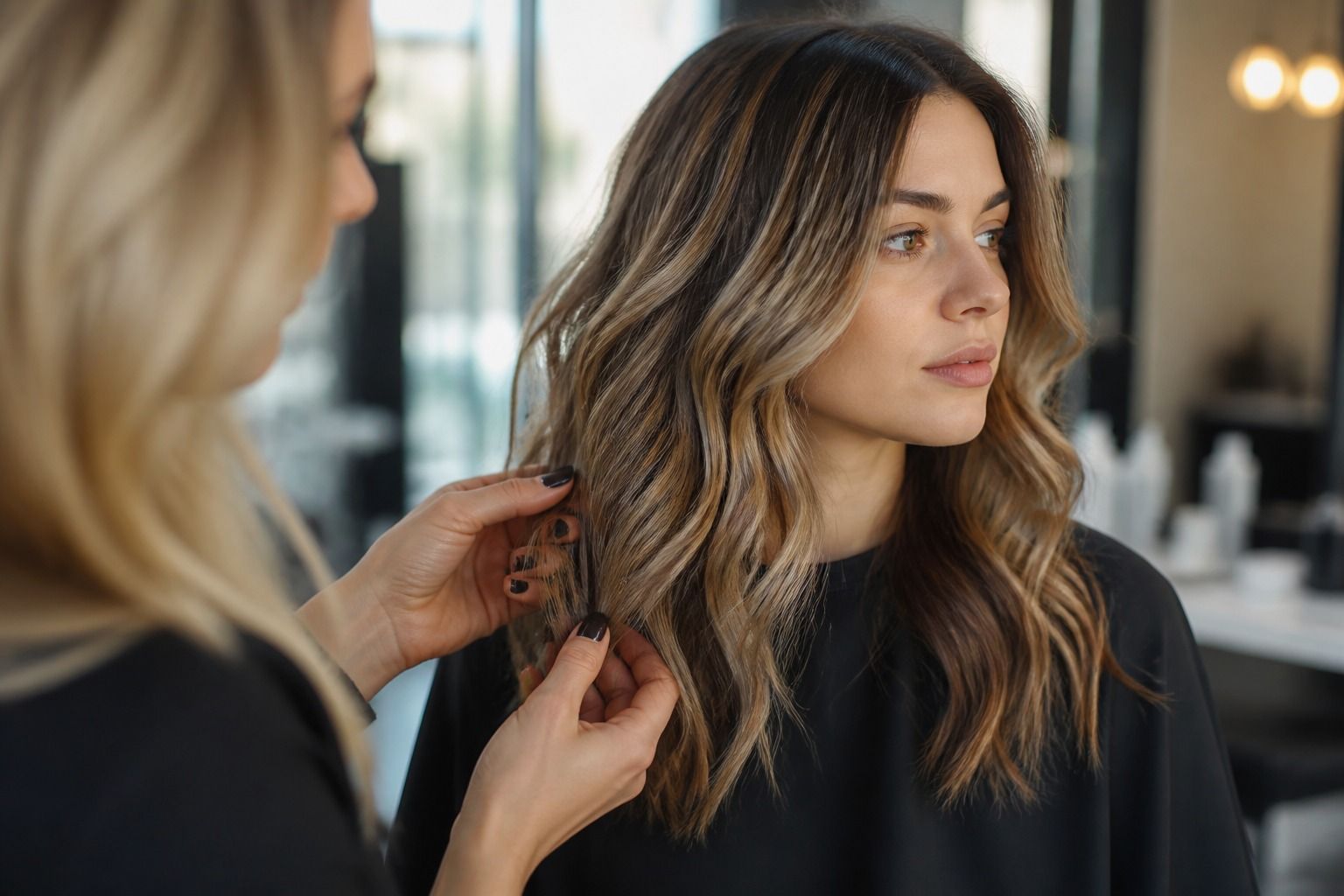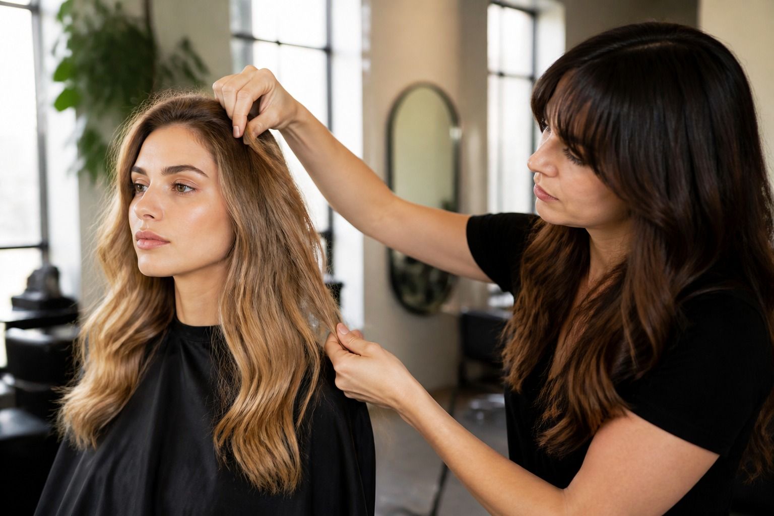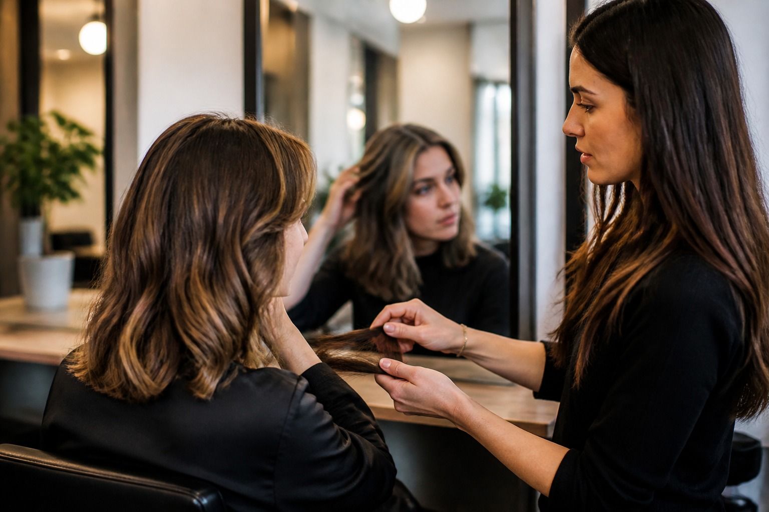
A hair colour try-on can be useful before you book an appointment, but it is best treated as a visual conversation starter rather than a promise. The preview is strongest at showing direction: darker or lighter, warmer or cooler, more dramatic or more blended. It is much weaker at predicting the exact result on your hair, especially when the photo has warm lighting, the hairline is partly hidden or the current colour has been altered by previous dye. Read the image in layers and you can take a useful idea to the salon without mistaking a virtual shade for a formula.
What a try-on preview is good for
The most helpful question is not whether the preview looks pretty. Ask what decision it has made easier. You may be comparing a cool deep brunette with a softer neutral brown, deciding whether a copper direction feels too bright, or checking whether a darker root would suit your usual haircut. A hair color try on can narrow those choices quickly when the photo stays consistent.
Use the preview to judge the size and position of the change. Does the colour alter the whole silhouette, or only add a different reflection when the light catches the lengths? Does a darker virtual shade make your eyes and brows look clearer, or does it pull attention toward a heavy block around the face? Does a highlight placement still make sense with the parting and layers you actually wear?
It is also useful for discovering language. You may begin with a vague wish for a richer brown and notice that the versions you save are all clear, cool and medium-deep. Or you may prefer a warm beige result even though the first reference images were labelled blonde. The labels attached to a virtual shade are not always precise; the visual pattern across several previews tells you more.
Keep the change modest at first. A preview of dark brown over medium brown can show whether you like more depth. It cannot tell you how a near-black result will feel after the novelty has gone, or how quickly a pale root will become visible. Try one meaningful change at a time so you can tell what you are reacting to: depth, reflection, saturation or the placement of lighter pieces.
Which parts of the image are usually wrong
The virtual hairline is often the least trustworthy edge. A tool may paint a tidy shape over the forehead and temples, leaving out fine baby hairs, sideburns, loose strands or the small gaps created by a parting. The result can look cleaner than real hair because the mask has removed the irregular details that make colour transition visible.
Check the area around the ears, the nape and the top of the forehead at full size. If the colour stops in a perfect curve, treat that border as a technical limitation rather than a real hairline. This matters when you are considering a dark root, a bright face frame or a full head of colour. In a salon, the stylist will need to work with the actual density and direction of those fine hairs.
Highlights can also be painted too evenly. A preview may distribute pale strands in a regular pattern while real highlight placement depends on the haircut, the parting, the density of the hair and how the light falls on the head. A few bright pieces around the face can look convincing in a still image but may be invisible when your hair is tied back. Save the preview, then ask where the lighter pieces would sit when you wear your hair in its normal style.
Root colour is another common blind spot. A virtual shade can cover the visible lengths while leaving the impression that the root, mid-lengths and ends all begin at the same level. If your hair has old highlights, grey strands, a grown-out balayage or several layers of colour, the salon result may have more variation. That variation can be attractive, but it needs to be planned rather than discovered accidentally.
Look at the background and the skin as well. If the whole image has a yellow cast, the preview may make cool hair look neutral and warm hair look more intense. If the face has been smoothed or brightened, the contrast between the virtual shade and your features is harder to judge. A clean preview still cannot reproduce the way a colour moves in real daylight, but it can give a fairer starting point when the original photo is clear.
How texture and length change the impression
Hair texture controls how much of a colour is seen at once. Straight hair presents broad surfaces, so a dark or highly saturated shade may look more solid. Wavy hair breaks the surface into bands of light and shadow. Curly and coily hair show colour around bends and raised sections, while some of the depth remains inside the curl. A virtual shade that looks smooth on a straight selfie may look more dimensional in real curls, or less even if the colour has been applied to uneven porosity.
Think about your everyday finish, not the hair in the photo alone. If the preview shows your hair straight but you usually wear it air-dried, the scale of the change may be misleading. If you normally use a diffuser, ask whether the lighter pieces would catch light on the outer curl or disappear into the interior. With a short cut, the colour follows the shape of the head and can make a crop look sharper. With long hair, the same shade has more length to fade through and more ends to maintain.
Hair length affects the visual weight of the roots too. On a chin-length bob, a two-centimetre grow-out line can be obvious because the parting and perimeter are close to the face. On long layers, the line may be less visible when the hair is moving, but the lengths can show old colour and dryness more clearly. The preview is a flat image; it does not show what happens when the ends swing, separate or catch a different light.
Consider density and cut details. Fine hair can look fuller with a uniform dark colour, yet a strong dark perimeter may make the ends seem thinner if they are wispy. Thick hair can carry a deep shade well, but a solid result may feel heavy without internal movement. Bangs, face-framing layers and a strong side part alter where the virtual colour sits. If the preview does not match your haircut, use it for the colour family only.
How to compare two shades without changing the setup
Comparison works only when the photo conditions stay fixed. Use the same image, crop, face position and hair state for each virtual shade. Do not compare a warm brown on a daylight selfie with a cool brunette on a night-time photo. The difference in the room may be larger than the difference between the colours.
| Check | Keep consistent | What the difference can tell you |
|---|---|---|
| Light | Use one original photo before trying another shade | Whether the reflection changes, rather than the camera changing the result |
| Hair shape | Keep the same parting, length and texture | Whether the colour works with the way you actually wear the cut |
| Face area | Keep brows, skin and expression unchanged | Whether the contrast feels balanced around the eyes and hairline |
| Screen | View both images at the same brightness | Whether one shade is truly deeper or only appears stronger on the display |
Compare in a fixed order. Start with depth: which image looks lighter or heavier around the face? Then check reflection: do you see brown, gold, red, violet or blue? Next look at contrast: does the colour sharpen your features or compete with them? Finish with maintenance clues: which version would show a pale root, faded ends or uneven texture most clearly?
Do not zoom in until you have judged the overall shape. A zoomed preview can make a few painted pixels look like a precise highlight plan. At normal viewing size, you can see whether the shade belongs with your haircut and clothing. Then zoom into the hairline, crown and ends to find the areas that need a reality check.
Screen brightness can change the answer. A phone on a bright setting may make a dark brown look flatter and a red shade look more vivid. A dim screen can hide the difference between a neutral brunette and a blue-black. Put the two images side by side on the same device, then take a short break before looking again. If your preference changes every time the light changes, choose a family of colour rather than an exact-looking result.
What to save for a salon conversation
Save a small set of useful references, not a gallery of every version you tried. Keep the original photo, one preview that shows the preferred direction and one that demonstrates what you do not want. A reference screenshot is valuable when it preserves the full head, the face and the conditions of the preview. Crop out less than you think; the stylist needs to see the length, parting and face-framing area.
Write down the practical detail beside each image. Note whether your preferred shade is darker, cooler, warmer, redder or more blended than your current hair. Record what your hair is doing now: natural root, old permanent colour, faded gloss, highlights, grey coverage, stretched curls or heat-styled ends. These facts are more useful than a shade name copied from the screen.
Bring up the limitations directly. You can say that the preview suggests a clear deep brunette, but you understand the result will depend on the current root and previously coloured lengths. If the image shows highlights, ask whether the placement would suit your haircut and whether the light pieces would require more frequent maintenance. If the preview makes the hairline look perfectly filled, ask how the real fine hairs will be treated.
A good salon conversation includes the first fade and the grow-out. A virtual shade shows a finished-looking moment, usually with uniform shine. It does not show the colour after shampooing, sun exposure, heat styling or a few centimetres of new growth. Ask what will remain when the reflection softens and how often the tone or root would need attention. A result that looks slightly less dramatic in the preview may be the better choice if it still works between appointments.
Use the try-on to make the appointment more specific, not to remove the consultation. The stylist can see your hair texture, density, porosity, root colour and ends in person; the image cannot. If the preview has helped you choose a direction and describe the limits, it has done its job. The final decision should leave room for the hair you have, the cut you wear and the maintenance you will actually keep.