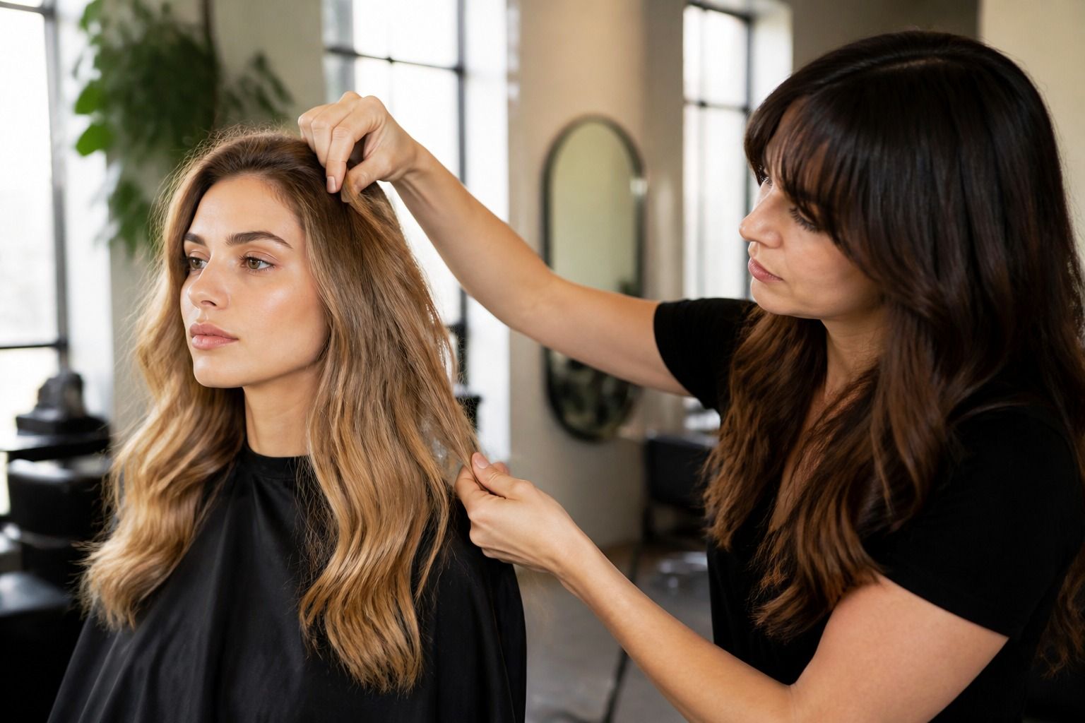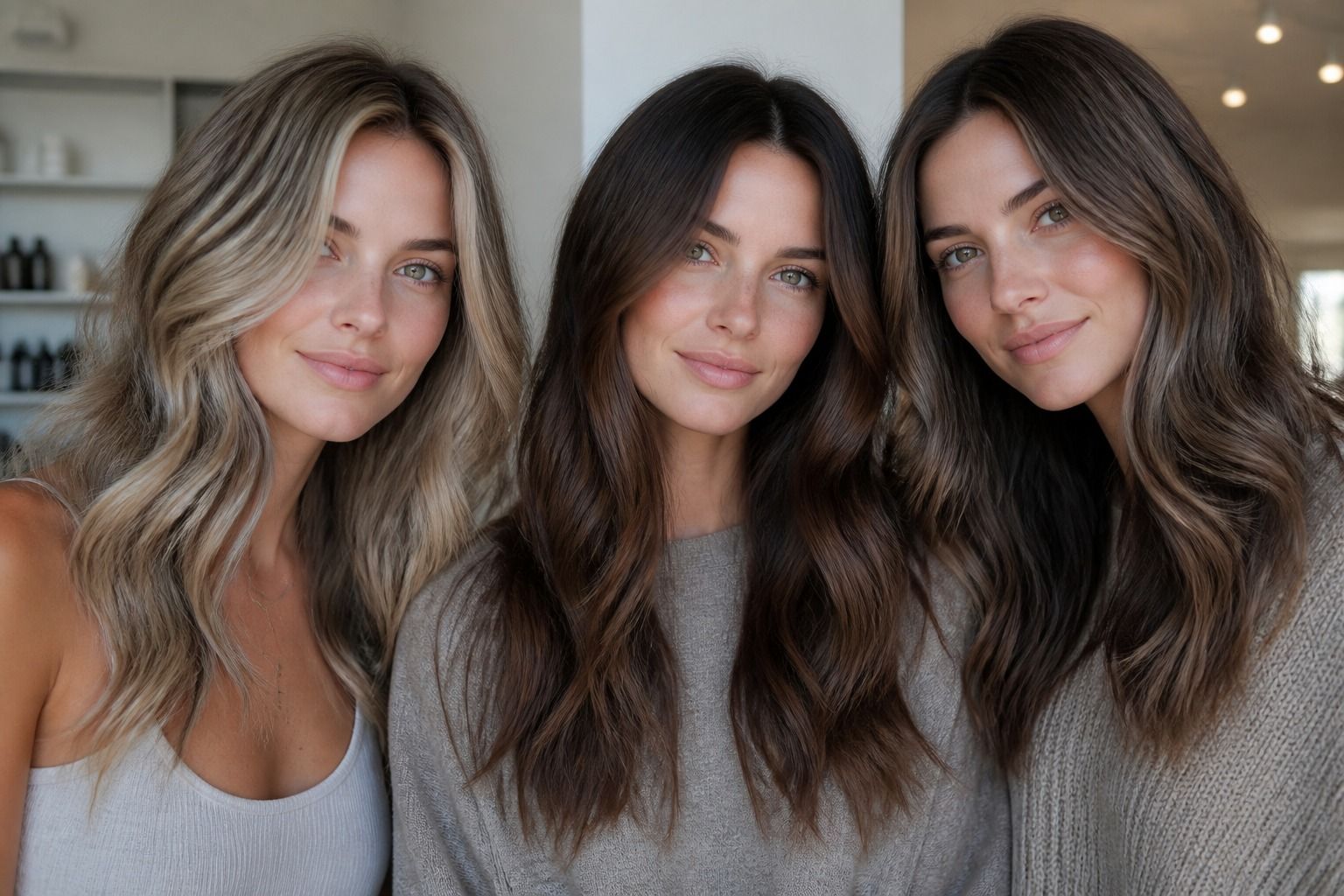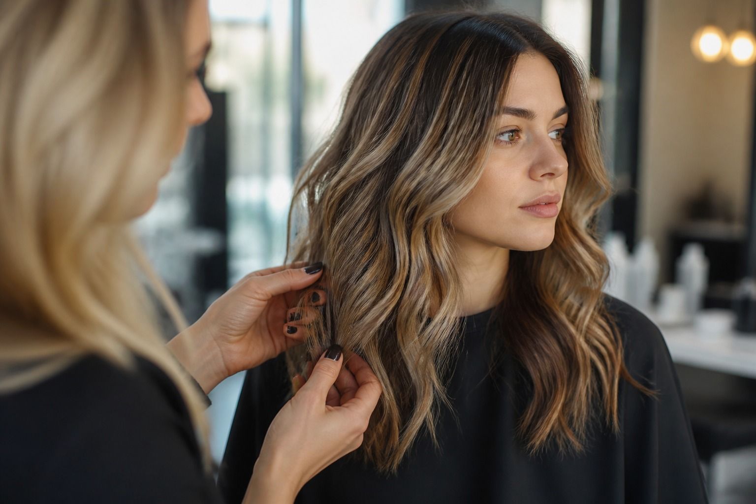
The best virtual hair color try on is the one that helps you make a clearer decision about your own hair. That sounds less exciting than a list of app names, but it is far more useful. A preview can look polished while missing the hairline, flattening curls, hiding dark roots or turning a soft brunette into a solid block of colour. Compare the image you receive, the controls you can use and the way the result behaves on more than one photo. You are choosing a planning aid, not buying a guaranteed shade.
Define what best means for your decision
Start with the change you are considering. Someone deciding between neutral brown and a warm copper needs a different preview from someone wondering whether a pale blonde will make the face look washed out. Write the decision in one sentence before opening a tool: I want to compare depth, I want to see whether a face frame suits me, or I want to judge a darker colour against my current brows. This keeps a dramatic filter from taking over the conversation.
A good comparison has a clear starting point. Use the same dry, unstyled photo for every test, then make a second set with the hair worn in the way you normally wear it. A colour that looks convincing on loose hair may feel wrong when your daily style is a blunt bob, a low ponytail or a defined wave. Long hair and short hair also distribute colour differently. The length is part of the decision, not a background detail.
Think about the kind of result you need. A full-colour overlay is useful for judging depth and general direction. It says much less about balayage, scattered highlights, a root shadow or a few lighter pieces around the face. If your salon idea depends on placement, the best tool is the one that lets you inspect that placement, even if its solid-colour previews are less flashy. A technically modest comparison can still be the better one.
Check the hair edges before judging the shade
Hair segmentation is the first practical test. Look at the parting, temples, baby hairs, ears and the line where the hair meets a pale background. If the mask cuts away fine strands, the preview can make a colour seem neater and denser than the real result. That matters when you are comparing a light blonde, a red tone or a colour close to the skin. A clean edge is not cosmetic polish; it changes the amount of hair the eye sees.
Curly and wavy hair exposes weak edges quickly. Individual bends create small gaps, and a simulator may fill those gaps with skin or background colour. Check the crown, the sides of the face and the ends rather than staring only at the centre panel. Straight hair needs a different check: look for a hard vertical border on the outer length, especially with a dark shade. If the overlay stops at an artificial line, the colour impression is unreliable.
Roots deserve their own inspection. A preview may recolour the lengths while leaving the natural root untouched, or it may cover every pixel with one even shade. Neither view tells you exactly how regrowth will look. Still, it can show whether you prefer a noticeable root contrast or a softer transition. Zoom the image if that is possible and check whether the hairline changes colour in the same way as the mid-lengths.
Lighting can hide an edge problem. A bright selfie against a plain wall gives the tool an easier job than a side-lit photo with flyaways, glasses or a busy background. Test the same head in a second light only after you have checked the first mask. If the colour shifts because the entire image has a strong yellow or blue cast, that is a camera issue, not evidence that one shade is more flattering.
Compare colour range and texture handling
A shade library should cover the direction you are actually considering, including sensible middle steps. If you are moving from medium brown to blonde, compare beige, neutral and cooler options instead of jumping from brown to the palest card in the menu. The difference between a soft light brown and a dark blonde may matter more in daily life than the extremes. The same applies to red: copper, auburn and rose-brown are separate conversations, even when a screen groups them under one warm label.
Look for controls that let you adjust depth, warmth or placement without changing the entire face. A fixed filter often makes every hair strand the same colour. That is fine for a first direction check, but it cannot represent natural variation, lowlights or highlights. If the tool offers a face frame or partial placement, examine whether the lighter pieces start where a stylist could realistically place them. A stripe that begins at the wrong point can make a good idea look awkward.
Texture handling has two parts. The first is visual: does the preview keep the shape of curls, waves or straight sections? The second is tonal: does light still break across the hair, or has the overlay turned it into a flat surface? Gloss, density and movement are part of how colour is read. A dark shade on dense curls may appear deeper than the same shade on fine straight hair because less light reaches the screen from the surface.
Compare your current hair with the proposed shade in the same frame. That makes undertone and contrast easier to notice. A neutral blonde beside a warm beige can look almost identical in one photo, then separate clearly when the hair is placed near the eyes and brows. You do not need a perfect colour match to learn something useful. You need enough control to see which direction changes the balance of the face.
Look for repeatable results rather than one impressive preview
One attractive image proves very little. Run the same shade more than once if the tool allows it, using the same photo and the same settings. If the hairline, depth or face-framing area changes each time, treat the result as an idea generator. It may still be helpful, but it is not a stable comparison. A tool that produces a plain result consistently can be more useful than one that occasionally creates a perfect-looking image.
Keep the screen conditions steady while comparing. Phone brightness, night mode and a warm indoor lamp can make the same blonde appear cream, yellow or grey. Save previews or use an exported image when available so you can compare them side by side. A watermark is not automatically a quality problem, but it can cover the very edge or face area you need to inspect. Note where it sits before you decide what the image is telling you.
Repeatability also means repeating the test with a realistic hairstyle. First use hair down so you can inspect the full length. Then try the parting and shape you wear most often. A colour may look balanced in a full front view but too heavy at the temples when the hair is tucked behind the ears. Short hair needs a check of the back and side silhouette too, because a face-on preview can hide how much dark or light colour sits around the jaw.
Be cautious with a preview that changes the skin tone, eye colour or facial features along with the hair. That may be a general beauty filter rather than a focused colour comparison. The more of the image changes, the harder it becomes to judge the hair alone. A useful try-on leaves your face recognisable and gives you a way to isolate the hair change.
What to record before choosing a direction
Take the strongest two or three previews into a practical comparison. Record the starting shade, the lighting, the hairstyle and what changed at the hairline. Add a sentence about the real decision each image helps with. For example, one preview may show that a deeper brunette gives the eyes enough contrast, while another may show that a pale blonde only works when the root stays slightly darker. These are salon questions, not promises about an eventual formula.
| What to compare | What a useful result looks like | What to question |
|---|---|---|
| Hair edges | Parting, temples, ears and fine strands stay believable | Does the mask cut off curls or create a hard outline? |
| Colour range | You can compare middle shades and warm or cool directions | Are several distinct shades reduced to one vague label? |
| Texture | Light and shadow still move across waves, curls or straight hair | Has the overlay turned the hair into a flat block? |
| Repeat testing | The same image gives a similar result when repeated | Does the preview change with no change in your input? |
| Export and watermark | You can save a clear reference for a consultation | Does a mark cover the hairline, face frame or parting? |
Then explain the direction in ordinary language. Say that you like the depth but want less warmth, or that you prefer the lighter ends with a natural root. Mention your current colour, previous dye and the way you wear your hair. A stylist can work with that information. An app name alone gives them very little.
The best virtual hair color try on is therefore a repeatable comparison that leaves room for real hair. Use it to narrow the choice, notice your contrast and save a visual starting point. Let the starting shade, texture, regrowth and placement decide the next conversation. The preview earns its place when it helps you ask a sharper question before you book the chair.